
The Latest Trends in Website Design for Online Excellence in 2023


-
Interactive User Experiences
-
Micro-Interactions and Scroll-Triggered Animations
Imagine this: You're on a website, and as you hover your mouse over a button, it does a little dance – maybe it bounces or changes color. Those little dances are what we call micro-interactions, and they're all the rage in web design right now.
But that's not all. There's another cool trick up web designers' sleeves – scroll-triggered animations. As you scroll down a page, elements come to life. It's like a story unfolding right before your eyes. Web design is getting fancier by the minute!
 Image source: https://uxplanet.org/
-
The World of 3D and Parallax Effects
Websites are taking a leap into the third dimension. 3D visuals and parallax effects create a sense of depth that immerses users in a virtual world. Whether it's a 3D product showcase or a parallax-scrolling storytelling experience, these effects are making websites more visually stunning and memorable. Here is an Example of Parallax Scrolling:
 Source Code: https://www.invisionapp.com/
-
Micro-Interactions and Scroll-Triggered Animations
-
Immersive Visuals and Bold Typography
-
Maximalism and Larger-Than-Life Typography
Minimalism, step aside – maximalism is in the spotlight for 2023! We're talking about vibrant colors, bold patterns, and typography that's so big, you can't ignore it.
Maximalist designs are all about making a grand entrance and leaving everyone in awe. It's like your website is wearing its party hat all year round!
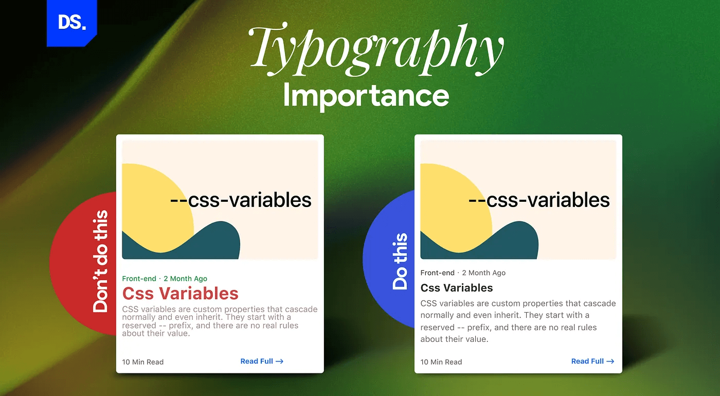 Image source: https://uxplanet.org/
-
Vivid Color Schemes for Impact
Colors are stepping into the spotlight in a big way. They're not just the background; they're front and center in the design.
Designers are going wild with vibrant, contrasting color schemes. It's all about creating that "wow" factor and directing your focus. The right colors can even stir up emotions and make your online experience a whole lot more exciting. It's like painting with a rainbow on your website!
-
Maximalism and Larger-Than-Life Typography
-
Eco-Friendly Design
-
Eco-Friendly Design: Nurturing Sustainability in the Digital World
Sustainability is not just a buzzword; it's a way of life, and web design is no exception.
You've got these eco-conscious color palettes inspired by nature, and folks are using renewable resources like eco-friendly web hosting. Going green isn't just responsible; it's the new cool kid on the block.
It's like giving Mother Nature a high-five while you design your website!
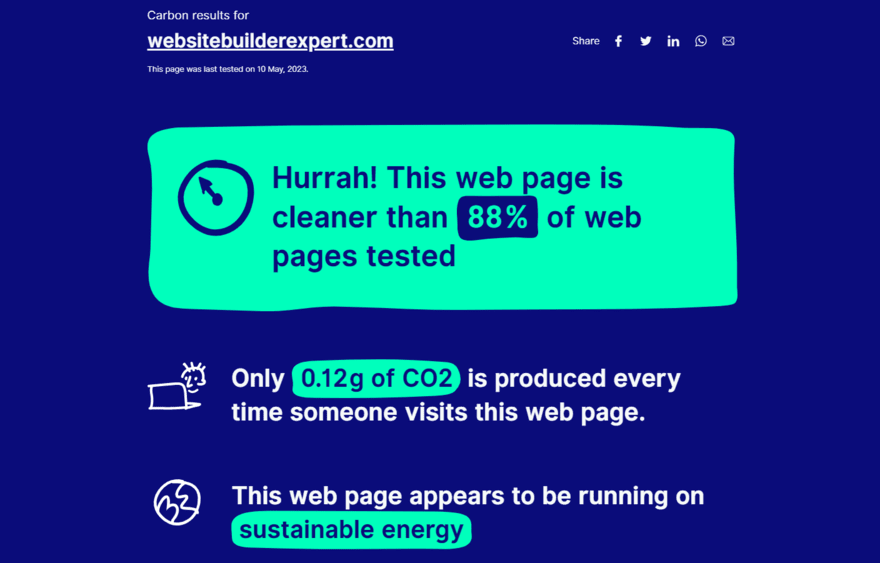 Image source: https://www.websitebuilderexpert.com/
-
Eco-Friendly Design: Nurturing Sustainability in the Digital World
-
Voice User Interfaces (VUI) and AI Integration
Voice User Interfaces (VUI) and Artificial Intelligence (AI) integration stand as transformative forces, reshaping how users interact with digital platforms.
They're not just part of the package; they're the secret sauce for making user experiences super amazing. And there's so much to explore in this realm. It's like peeling back the layers to see how these tech wizards are making our online lives better.
-
AI-Powered Personalization
Artificial Intelligence (AI) is like your personal genie when it comes to personalization. These AI algorithms look at how you behave online and then serve up content and suggestions that are just for you.
It's like having a personal shopper for websites! And guess what? This not only makes your online experience top-notch but also boosts how much you engage with stuff and even how often you end up making those clicks. AI is like the secret sauce that makes everything feel tailor-made for you.
 Image source: https://medium.com
-
Conversational Interfaces and Personalization
Conversational interfaces, such as chatbots and voice assistants, are becoming more sophisticated.
Whether you've got questions or need a hand with making a purchase, these conversational interfaces are like your trusty sidekicks, making your online adventures smoother and more user-friendly. It's like having a friendly guide every step of the way!
-
AI-Powered Personalization
-
Minimalist Interfaces
 Image source: https://uxplanet.org/
-
The Beauty of Simplicity
While maximalism is on the rise, minimalism still holds its ground. Minimalist designs are all about keeping it simple and uncluttered. It's like a breath of fresh air for your website.
You get clean, no-nonsense interfaces that let you focus on what's important. And the bonus? Your website loads faster, so it's a win-win! It's like decluttering your digital life.
-
Content-First Design Approach
They say "Content is King," and it's true.
Websites are all about putting content front and center, making it super easy to find and totally captivating. We're talking about layouts and typography that are like a fancy frame for your content, making it look like a superstar. Content-first design is the name of the game, and it's a win for everyone.
 Image source: https://uxdesign.cc
When we talk about putting content first, it's not just a one-step thing. It's more like a journey in phases.
Instead of coming up with a design and then squeezing in the content, we're flipping the script. It's all about digging into the content, figuring out what it needs to shine, and then crafting a user experience design around it. We're talking wireframes, visuals, and all the good stuff. It's like creating the perfect stage for a content superstar to shine!
-
The Magic of Negative Space
Negative space, also known as white space, is the uncluttered area around design elements.
Negative space is all about balance and making it easy for you to take in the information. It's not just a design trend; it's like a superpower for making things user-friendly.
-
The Beauty of Simplicity
-
Dark Mode and Beyond
-
Beyond Dark Mode: Ambient Light Sensing and Custom Themes
Dark mode has gained popularity for its sleek appearance and reduced eye strain. But what's next? Websites are implementing ambient light sensing, automatically adjusting the theme based on the user's surroundings.
 Image source: https://appmaster.io/blog/dark-mode-web-design
Dark mode isn't just a style; it's a whole vibe for 2023. It's like a statement that says, "Hey, we're all about being inclusive, adaptable, and eco-friendly."
Web design is leveling up, focusing on what users need, and being kind to the planet. It's all about making everyone feel at home on the internet, no matter their preferences. Dark mode is like the cool friend who's got your back.
-
Beyond Dark Mode: Ambient Light Sensing and Custom Themes
-
Accessibility-First Design
-
Inclusive Design Principles and Mobile-Friendly Layouts
When it comes to web design, accessibility is the name of the game. It's not just a box to check off; it's at the heart of how websites are born and bred.
In 2023, we're all about accessibility-first design. It's not a passing trend; it's a promise to create a web that's welcoming, fair, and ready for all kinds of users.
One way to do it is by cranking up the color contrast. Think about folks with low vision or other visual challenges. They need content to be crystal clear. So, we're talking about simple color combos that make text pop on images, icons, buttons, and all the visual stuff. It's like making sure everyone gets a front-row seat!
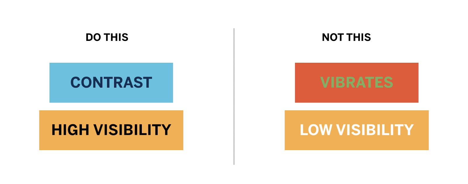 Image source: https://www.hattaway.com/
In 2023, as the digital landscape continues to evolve, websites that prioritize accessibility are not just ensuring legal compliance; they are creating a web that truly serves everyone.
-
Inclusive Design Principles and Mobile-Friendly Layouts
-
Mobile-First and Thumb-Friendly Design
Mobile devices are the primary means of accessing the internet for many users. Designing with a mobile-first approach ensures that your website looks and functions flawlessly on smaller screens.
So, in 2023, it's all about this mobile-first approach. It's like making sure your website is a superstar on those smaller screens. It's not just a trend; it's the way things are going. Businesses and designers are all in on this mobile game, making sure your online journey is smooth, no matter where you are.
-
Prioritizing Mobile Users
When it comes to nailing it online, mobile users are like our VIP guests.
Understanding what they like, what they need, and how they roll in the digital world is the secret sauce to making websites that really hit the spot. So, why do they deserve this special treatment? Let's dive into it.
- Mobile Traffic Dominance: The data is clear—mobile traffic surpasses desktop traffic for a vast majority of websites. Ignoring this significant portion of your audience is no longer an option.
- User Expectations: Mobile users have distinct expectations when it comes to website interactions. Prioritizing mobile users means delivering the experience they expect.
- SEO and Search Rankings: Search engines, notably Google, prioritize mobile-friendly websites in their SEO rankings. By optimizing for mobile, you enhance your visibility in search results, attracting more organic traffic.
- E-Commerce and Conversions: If your website involves e-commerce or lead generation, catering to mobile users is paramount. An intuitive, mobile-responsive design can boost conversion rates and revenue
-
Thumb-Friendly Navigation
As mobile dominance unfolds, ergonomic thumb-friendly navigation is central to a seamless user experience.
They're even getting fancy with gesture controls and layouts that magically adapt to your moves. It's all about keeping things clean and comfy on your mobile screen. It's like a spa day for your thumbs!
 Image source: https://medium.com/
-
Prioritizing Mobile Users
-
Augmented Reality (AR) and Virtual Reality (VR) Integration
Incorporating Augmented Reality and Virtual Reality into web design transcends conventional browsing, ushering in a new era of immersive experiences.
AR is like this digital fairy dust that adds virtual stuff to your real surroundings. VR is like a teleporter that whisks you away to whole new worlds online. It's not just browsing; it's like stepping into a whole new dimension of web experiences.
 Image source: https://www.linkedin.com/
- The AR Revolution: Augmented Reality (AR) is revolutionizing the way users interact with websites.From trying on virtual clothes to visualizing products in real-world environments, AR is adding a new dimension to online shopping.
- Immersive VR Experiences: Virtual Reality (VR) is not limited to gaming. Websites are using VR to create immersive experiences, whether it's exploring a virtual museum or taking a 360-degree tour of a destination.
-
Blending Reality with the Virtual World: The lines between reality and the virtual world are blurring, thanks to AR and VR integration.
Websites are offering users a taste of both realms, creating unforgettable experiences.
-
Data Privacy and Ethical Design
Data privacy and ethical design have evolved into pivotal considerations for web designers and businesses a like.
People have become super aware of how valuable their personal info is. They want websites to treat it like gold, and who can blame them? With all those data breaches and privacy hiccups, trust is a big deal. Websites need to show that they've got our backs when it comes to keeping our info safe and sound. It's all about respect and integrity in the digital realm!
-
Respecting User Privacy and Ethical Data Usage
Okay, let's get real. Respecting user privacy and playing by the rules when it comes to data is like the golden rule of web design.
In an era of data breaches and everyone getting a bit twitchy about their personal info, users are like internet detectives. They want to know you're treating their data with care and not doing anything sketchy with it. It's all about being a responsible and trustworthy web buddy.
-
Respecting User Privacy and Ethical Data Usage

